Try reading a spreadsheet with thousands of rows and answering this: In which month did revenue start to decline?
Now, look at a line chart: The answer appears in seconds. The gap between those two experiences represents the true value of data visualization.
This article by OMN1 Solution will help you understand this technique, why businesses increasingly rely on it, and how to use it effectively.
What is Data Visualization? Translating Numbers into the "Language of the Eyes"
Data visualization is the technique of transforming information and figures into charts, graphs, or maps. Visuals enable viewers to identify trends, recurring patterns, and anomalies—insights that are easily overlooked when buried among hundreds of numerical cells.
Its most valuable advantage is that even non-experts can grasp the message. When everyone in a meeting views the same chart and draws the same conclusion, the risk of misinterpreting data is significantly reduced.
Why Are Businesses Increasingly Relying on Visualization?
Visualization filters out "noise," highlights key insights, and tells the story behind the numbers, allowing people to observe, interact with, and understand data in the shortest possible time.
Three frequently cited statistics illustrate this trend:
- Gartner forecasts that by 2022, approximately 90% of businesses will use visualization tools for analysis and decision-making. A Tableau survey reveals that 74% of users gain a better understanding of information, and 94% report improved work efficiency.
- Forbes notes that over 80% of leading enterprises incorporate visualization into their marketing strategies, enabling deeper customer insights and more precise campaign measurement.
Big data needs a map
Big data helps uncover critical information, predict trends, and create value. However, that massive volume of data is only useful if it can be interpreted. Visualization acts as a map: specialized tools have been developed to process and display large-scale data, allowing for exploration without cumbersome procedures.
An effective visualization typically meets three criteria: data is organized for readability; trends and key distinctions stand out; and a single, clear message is conveyed without cluttering the display with extraneous information.
Choosing a tool: Start with goals, not software
According to Market Research Future, the market for visualization tools is projected to grow by approximately 9% annually between 2019 and 2023. Software options range from simple to complex, and no single tool suits every business. Begin by asking, "What do we want to know?" (e.g., tracking revenue, analyzing customers, monitoring operations) before comparing software options. Teams also require foundational knowledge to master these tools more quickly.
Tableau: A prime example
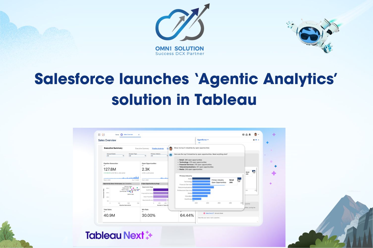
Tableau is a widely used analytics and visualization platform. Users can operate it without programming skills or deep technical expertise. The platform accelerates analysis, transforms results into easy-to-understand visuals, and updates in real-time as source data changes, ensuring reports never become outdated.

Choosing the Right Chart for the Question You Want to Answer
Bar charts and pie charts are merely the most familiar options. Broadly speaking, data visualization encompasses six categories: standard charts (two-axis), tables, graphs (using points, lines, or areas to compare variables), geospatial visualizations, infographics, and dashboards (aggregating multiple charts onto a single screen for analysis and reporting).
Within each category, specific chart types are suited to particular questions:
- Comparing values: Bar charts compare values via bar length; bullet graphs compare performance against targets; highlighted tables use color to group similar data.
- Viewing proportions: Pie charts show percentages relative to a whole; treemaps use nested rectangles to display related data.
- Viewing distributions: Histograms divide continuous data into intervals; box-and-whisker plots show distribution ranges; heat maps use color intensity to represent values (not necessarily related to temperature).
- Geospatial visualization: Area maps display values by country, state, or region (including choropleth and isopleth maps).
- Tracking progress: Gantt charts map tasks onto a timeline, commonly used in project management.
Conclusion
Data visualization enables businesses to interpret data more quickly, minimize errors in analysis, and make more accurate decisions. To implement it effectively, start by identifying the specific business questions you need to answer, then select the appropriate tools and chart types—rather than choosing the software first.
As a proud Salesforce partner, OMN1 Solution supports businesses in Vietnam by providing consulting and implementation services for data analytics and visualization using Tableau, helping to build clear dashboards and optimize decision-making efficiency.
👉 Contact OMN1 Solution today for a consultation on the data visualization solution best suited to your business.